yasc.scorecard.woebinplot
-
yasc.scorecard.woebinplot(data, stacked=False, grouped=True, width=0.2, loc1='best', loc2='best', **kwargs)¶ Visulize the binning.
- Parameters
- dataDataFrame
A data frame describing the binning of certain predictor.
- stackedbool, optional
Whether to make a stacked bar plot, by default False
- groupedbool, optional
Whether to make a grouped bar plot, by default True
- widthfloat, optional
The width of bar, by default 0.2
- loc1str, optional
Specify how to put legend in left subplot, by default “best”
- loc2str, optional
Specify how to put legend in right subplot, by default “best”
- Returns
- figmatplotlib.figure.Figure
The result figure.
- ax1matplotlib.axes.Axes
The axes object with the left subplot drawn onto it.
- ax2matplotlib.axes.Axes
The axes object with the right subplot drawn onto it.
Examples
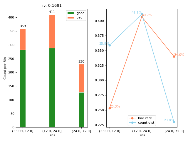
Make a stacked bar plot of the binning result.
>>> from yasc.data import german_data
>>> from yasc.scorecard import mono_bin
>>> from yasc.scorecard.util import woebinplot
>>> data = german_data()
>>> bin_stat = mono_bin(data.Creditability, data.DurationInMonth, duplicates='drop')
>>> woebinplot(bin_stat, stacked=True, figsize=(8, 6), loc2="lower center")
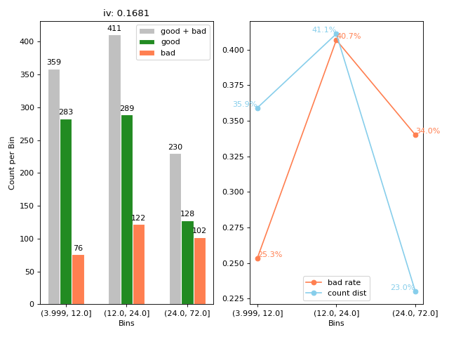
Make a grouped bar plot of the binning result.
>>> from yasc.data import german_data
>>> from yasc.scorecard import mono_bin
>>> from yasc.scorecard.util import woebinplot
>>> data = german_data()
>>> bin_stat = mono_bin(data.Creditability, data.DurationInMonth, duplicates='drop')
>>> woebinplot(bin_stat, figsize=(8, 6), loc2="lower center")